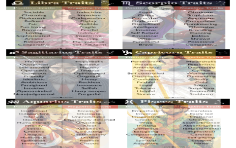
So, I was sitting around last week, right? Just totally spaced out, scrolling through stuff, when my kid—the little one who’s obsessed with astrology—tossed a notebook and a pencil at me. She goes, “Dad, draw me Pisces.” Now, usually, I just doodle fish or something quick, but she hit me with the kicker: “Draw Pisces as a person. Make her look totally dreamy.”
I tell ya, I hadn’t actually tried to draw something specific in maybe a decade. My drawings are usually just boxes and arrows for work, so this was a whole new kind of muscle memory to find. But whatever, a challenge is a challenge. I accepted it immediately.
I didn’t grab any fancy gear. Forget those expensive art pens and papers. I just had a half-used mechanical pencil—the kind where the lead breaks if you press too hard—and a spiral-bound notebook with coffee stains on the cover. That’s the honesty of my ‘studio.’
The Messy Start: Getting the Vibe Right
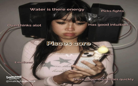
First thing first, Pisces is water, right? Flowy, gentle, maybe a little sad sometimes. You can’t draw a Pisces person standing stiff like a board. I needed motion. So, I grabbed the pencil and just started with big, looping lines. I wasn’t even drawing a person yet, just these smooth, C-shaped curves across the page, like a current.

I ended up wiping out the first attempt because the pose looked more like she was doing a terrible dance move than floating. Second go, I kept the curve, but I tilted the whole thing back, putting the center of balance way off the ground. That instantly made her look like she was sinking into water or drifting off to sleep. Much better.
I used the absolute simplest shapes to start:
- A circle for the head, not a perfect one.
- A long, slightly tapered rectangle for the torso.
- Simple stick lines for the arms and legs, just making sure the joints were bent softly.
Look, if you’re trying this, don’t even sweat the anatomy right now. If the leg looks weird, just cover it up with clothes later. That’s my secret weapon, covering up mistakes with fabric.
Putting on the ‘Fish’ Details
Once I had the basic structure that wasn’t embarrassing, I had to figure out how to put the ‘fish’ into the person. You can’t just draw a woman with a couple of fish slapped on her shirt. That’s cheesy.
I focused on things that move and drape:
The Hair and the Clothes.
I decided her hair would be ridiculous. I made it long—down to her waist—and drew it in big, layered waves, almost like seaweed or those fancy fins you see on aquarium fish. It looked like it was floating up instead of hanging down. This took a lot of messy erasing, I tell ya. I kept making it look like a helmet, but eventually, I got the flow right.
For the outfit, I didn’t want anything tight. I sketched a big, flowing dress with layers that looked transparent and ragged at the edges, like torn fishing net or the tail of a betta fish. I even drew one of the sleeves super long, dragging and hiding her hand, which was great because I hate drawing hands.
The Eyes and the Mood.
This was critical. Pisces needs that ‘I’m thinking about something you don’t understand’ look. So, I kept the eyes large and spaced apart. I didn’t draw a direct gaze. I made her look slightly off to the side and slightly down, like she’s looking at something far away, or just dreaming with her eyes open. I gave her just a hint of a smile, nothing too dramatic, very slight and soft.
Dealing with the Double Fish Problem
Okay, the biggest hurdle, the symbol is two fish. I thought about giving her two different-colored eyes, but that felt a little too dramatic for the dreamy vibe. I thought about two separate figures, but I only wanted one person.
The solution I landed on was simple, maybe even lazy, but it worked:
I sketched out two small, simple fish floating near her. One was drawn following the flow of her long hair, almost tangled in it, and the other one was just below her feet, swimming away. It gave the impression of duality—one pulling up, one pulling down—without cluttering the main figure. It instantly made the whole picture feel connected to the myth.
Finishing It Up
I didn’t even bother going back and refining every line. I took a dark blue ballpoint pen—the one I usually use for signing things—and just traced the best lines I had. It was shaky, it was messy, and it wasn’t perfect, but it was done. I put a few little messy dots around the figure to look like bubbles or glitter, slapped my initials in the corner, and handed it over. My kid loved it, which is the whole point, right?
The whole process took maybe an hour and a half of ignoring my phone. It’s a good reminder that you don’t need a degree or expensive supplies. You just need to sit down and make something with the simple tools you already have. Just follow the flow, let the mistakes turn into details, and don’t try to make it look like something out of a museum. Just make it look like yours.